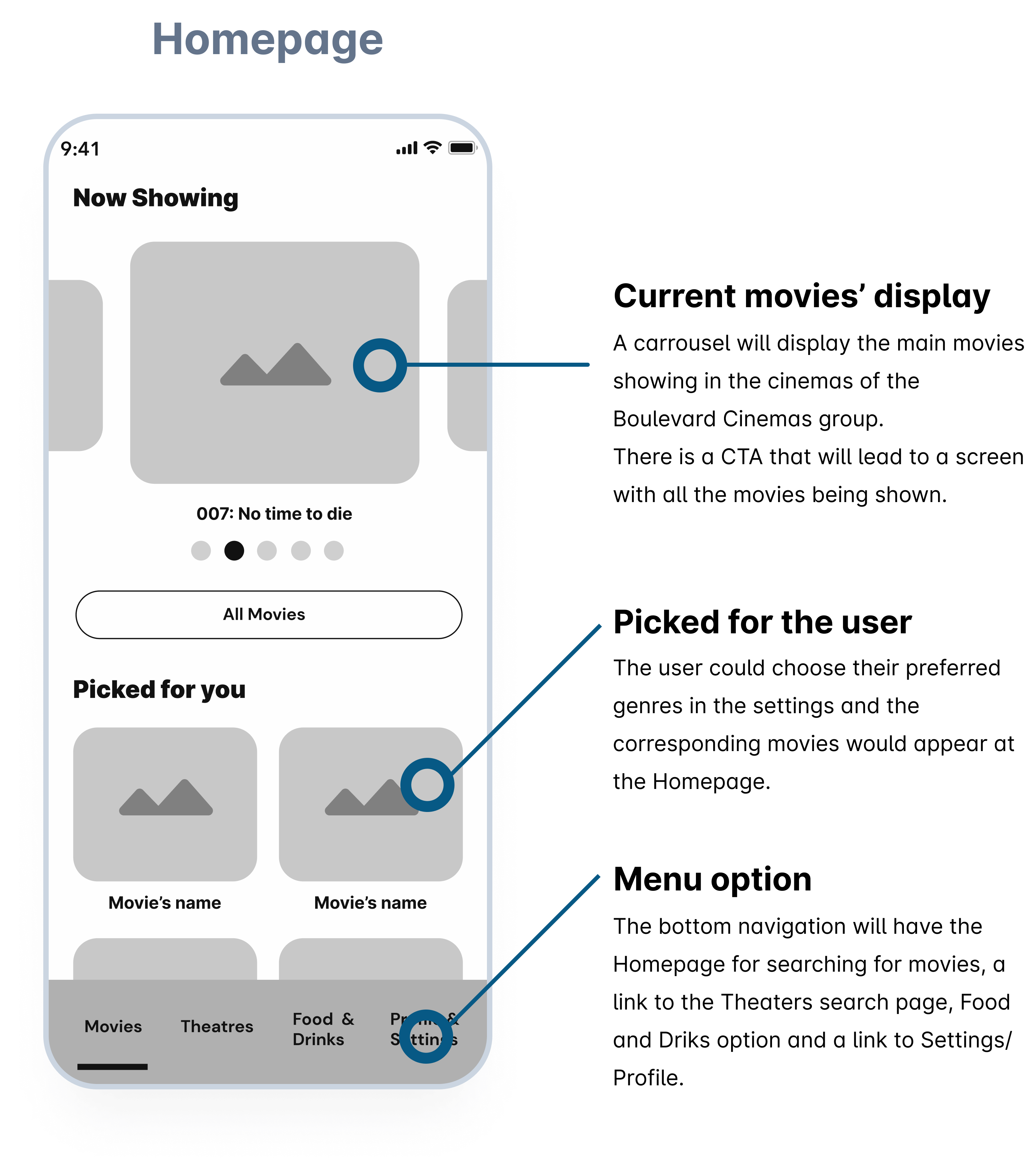
Wireframes to High-Fidelity
In translating the Wireframes to High-fidelity designs, I adopted a Dark Mode with tones of black, grey and yellow.
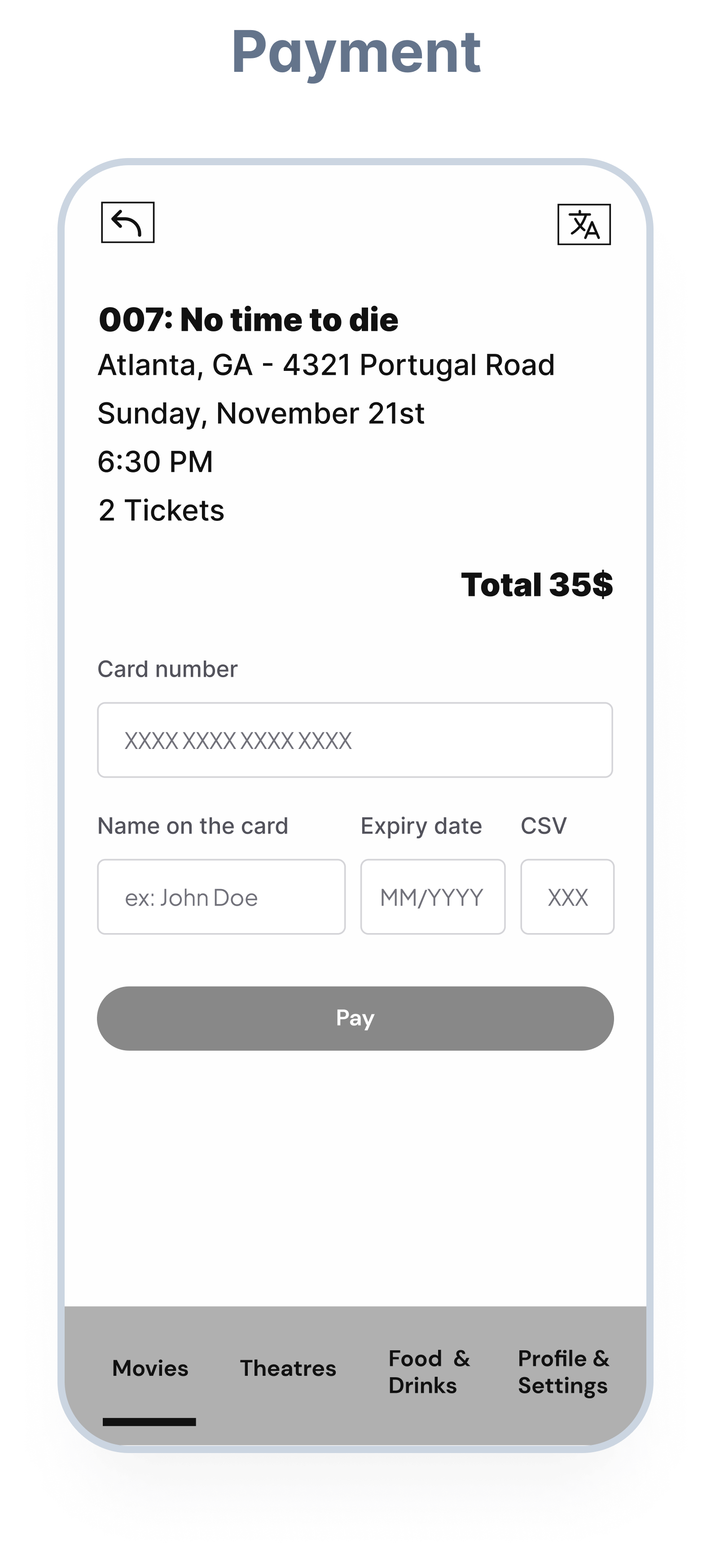
Below I show the changes I did to the ticket purchasing flow, from the usability revised Wireframes to the High-fidelity designs.